Шаг 1 перефразируем задание (я называю это предложение «Что? Где? Когда?»):
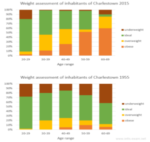
The presented charts demonstrate the comparative data on weight allocation among 5 age categories from 20 to 69 years old; the statistics are provided for Charlestown’s residents in 1955 and 2015.
Шаг 2️⃣ описываем 2 основных тренда в графике общими словами без деталей и цифр:
Overall, the average weight index increased significantly for all age groups (in 2015) over the studied period, meaning a higher risk of obesity for studied citizens, whereas in 1955 the majority of citizens were at an ideal weight with a higher risk of being underweight. The provided statistical research clearly demonstrates the direct correlation between the age and the obesity rate. (between age and weight)
Шаг 3️⃣ описываем детали графика, с цифрами, датами и сравнением трендов (можно одним или двумя абзацами):
It is implicitly clear from these charts that back in the 50’s, the overwhelming majority of locals had a healthy weight (approximately 70% for all studied people). In sharp contrast, the oldest generation in 2015 became vulnerable to excessive weight with more than a half of obese residents in this age group, while this percentage was close to zero in 1955. Similarly, the share of people with overweight in the middle age groups also doubled in 2015.
As for the youngest group, the ratio between people with weight deficit and those with healthful/ideal figures remained similar in 2015, 70 and 20 percent respectively, while only a negligible minority of them was at risk of weight surplus.


